
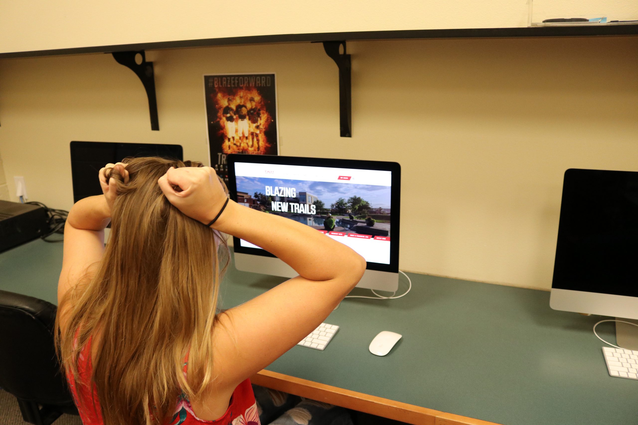
OPINION: I have been on the verge of pulling my hair out almost every day since the beginning of this month, and it’s not due to stress. I am feeling very frustrated over something that is supposed to be helping me. These frustrated feelings are all about the so-called “new and improved” Dixie State University website.
I have been a student at Dixie State University for three years and graduation is right around the corner. I have had almost no complaints about DSU and what it has to offer. My experience here has been close to perfect.
With that being said, the only complaint I have about my time at DSU is having to deal with the universities extremely frustrating website. When I heard in January that DSU was giving the website a facelift, I was ecstatic. A new website was what I believe the university needed.
Unfortunately, the new website is even worse than the old one and the only aspect that is pleasing about the update is an aesthetic look, but is in no way more useful.
The announcement of the new redesign took place in January. Aaron Campbell, director of web services, said the website was supposed to launch in April. However, April came and went and no new website redesign was anywhere to be found. The Dixie Sun News reported in August about the redesign launch being postponed, then finally earlier this month the new website was launched.
I sat down at the computer, eager to see what this new website had to offer. However, all I was given was even more frustration and more confusion about where things were. My number one complaint about the old website was having to use the search bar to find anything on the website. When using the new website, I still have to use that search bar.

I know I am not alone in experiencing these infuriating feelings. Complaints I have heard from my fellow classmates include difficulties finding professors names in the directory (because their names on the mobile directory are not what they actually go by), not being able to click on specific links on the website, and pages take forever to load.
In an article by the Dixie Sun News, students said they were hopeful that the new website would provide more clear links and would make a clear separation of information for both current students and future students.
I would think that as a university, you would want a simple and easy to use website so recruitment can be easier.
DSU, I know you can do better and I hope that another redesign can take place and will actually be useful.
Recent in Opinion:


